The Right Time to Switch From Static to Motion Mannequins
In the quiet weeks after December, when shop windows lose their sparkle and the streets slow down, many retailers begin to rethink how their displays show up. January is often one of the coldest and calmest months for retail. Without the activity of holiday shopping, it becomes even more important to offer something in the window that draws people in, without adding noise or mess.
Retail window display technology has made it easier for stores to create movement and interest. But the risk is doing too much. Bright screens, flashing lights, or oversized props can quickly make a space feel cluttered. As we move deeper into winter, the goal should be clarity, not complication. If a display feels considered and calm, people are more likely to stop and take a second look.
Movement does not have to be obvious or loud to make an impact. When used well, technology can sit quietly in the background while giving shape and purpose to the entire window. The challenge is to keep it simple, while still catching the eye.
Make Movement Feel Natural, Not Distracting
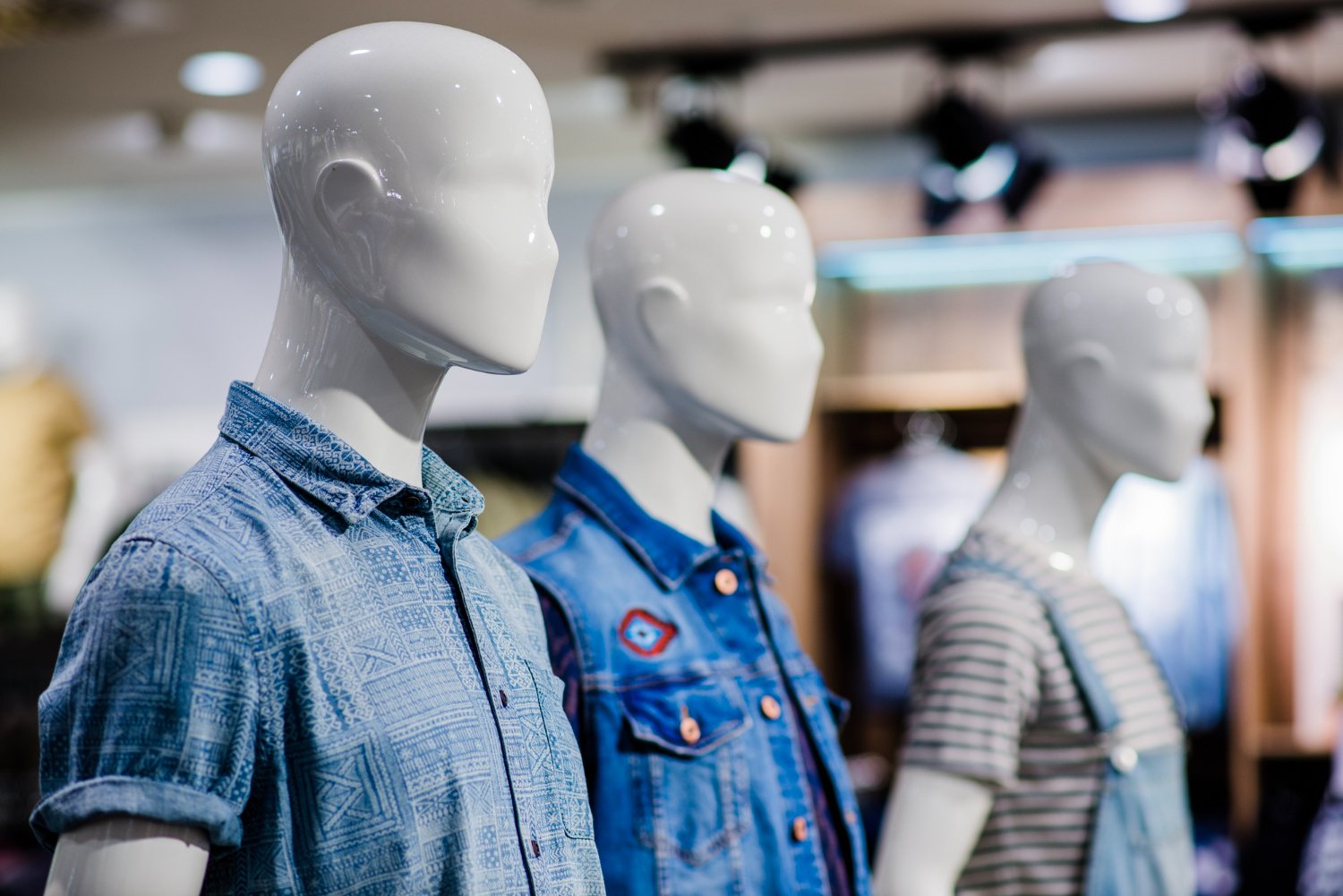
Simple movement works best when it does not draw too much attention to itself. A mannequin that turns its head slowly or shifts weight from one foot to the other can say more than any flashing sign. That kind of movement does not overpower the display; it enhances the items already there.
The goal is to make sure those motions feel alive, not robotic. If it matches the rhythm of how someone might move naturally, people are more likely to connect with it and pause. That pause can become a longer look and sometimes a step through the door.
Stores may be tempted by devices that do too much. That is when displays stop feeling helpful and start to feel busy. Instead of drawing the eye, those setups push people away.
Here is what usually works better:
- Choose one point of motion, like head position or arm lift
- Keep gestures small and steady, not fast or jerky
- Match the motion to the space so it does not look out of place
Technology should feel like it belongs. If a passerby notices the product first and the motion second, that is a sign of success.
Choose Motion Styles That Reflect Your Brand
Not all shops should move the same way. A fast shake of the shoulder might suit a sports store, but it would feel out of place in a calm hat boutique. Your window should carry the same pace and tone as your shop floor.
Think about the mood that suits a space before working with movement. Some stores need quiet moments. Others do better with energy. Tempo and attitude can be considered before anything else.
Different shop types call for different motion choices:
- Boutiques often benefit from slower turns and smaller, graceful lifts
- Gyms or athletic shops can use bolder actions, such as stretching or rotating to mimic warm-up poses
- Hat stores may only need a slight head tilt or nod to show off shape and position
None of these need to be big motions. The idea is to match the energy of the brand. When people notice this consistency, they are more likely to trust the experience inside.
Use Space Wisely Without Overloading the Window
January streets are often grey and rushed. Pedestrians are cold, layered up, and walking quickly. What shows up best in that setting is a clear display, not a busy one. This is where layout becomes just as important as technology.
Making room for motion does not mean filling empty space. It means giving the right things enough room to move and be seen. If the display is too crowded, even thoughtful movement can get lost.
Planning helps with that. Consider where the motion sits in the window. Leave open space around it so the gesture has room to be noticed.
Helpful layout notes:
- Use quiet zones where nothing moves to give the eye a break
- Let mannequins stand apart, not in rows, so their actions do not compete
- Point motion toward key pieces, like a coat or bag, so attention flows naturally
Clean windows always look better in January. Add the right movement to that simplicity, and you may catch more glances than a busier display ever could.
Avoid Chasing Trends That Do Not Fit the Store
Technology keeps changing, and it is easy to feel like you need the latest thing. Not every new trend belongs in your shop window. Big screens, interactive walls, or gesture-based setups might suit large retailers, but they rarely work in smaller spaces.
What matters more is what feels right. The most effective retail window display technology is not the flashiest; it is the clearest. A small robot that shifts posture or points to a product can do more than ten digital signs vying for attention.
It helps to pause before adding more technology:
- Ask if the display matches the feel of the shop
- Check that it shows the product clearly, not just the tool behind it
- Think seasonally: in winter, slower displays tend to feel warmer and more thoughtful
People do not always want complexity. What they often want is honesty and care in how things are shown. A window with just the right amount of technology can feel stylish, not overloaded.
When Simplicity Feels Lively
The best display setups look easy, but often take careful planning. Getting it right means knowing when to include motion and when to let stillness do the work. A quiet mannequin that glances sideways or adjusts its pose only slightly can give a window just enough rhythm to hold attention.
Shops that focus on fewer, smarter gestures tend to look cleaner, sharper, and more confident. Even during slower months like January, they draw in curious looks and give people a reason to stop in.
Simplicity does not mean showing less. It means showing better, keeping the movement honest, the space clear, and the story focused. When everything lines up, a little motion can go a long way.
Thinking about adding motion to your storefront while keeping your space clean can change your display and help your business stand out. Our focus is on integrating movement into your space without distracting from your product. At Motion Mannequin, we design dynamic mannequins that blend seamlessly with your shop and make all the difference. Discover how we have introduced subtle, focused motion into modern retail settings with retail window display technology and get in touch to discuss solutions for your space.